Platzbuchung
Intuitive Court Booking
{ 2024 }
- Role:
- Freelancing Senior Product Designer
- Scope:
- UI, UX, Design System, Branding
- PO's, Development
Platzbuchung is a digital booking platform that helps sports clubs manage courts, members, and activities in one place. It provides an intuitive system for reservations, communication, and club organization across web and mobile.
At its core, the platform structures how physical club resources are accessed and shared. Courts, time slots, and player participation are organized through a flexible booking system that allows clubs to define their own rules, availability, and usage logic.
Beyond booking, Platzbuchung supports the operational side of club management. Administrative processes such as payments, guest access, and booking restrictions can be configured within the system, helping clubs replace manual coordination with clear digital workflows.
For members, the platform creates a simple and transparent way to participate in club life. Availability, reservations, and club updates are accessible through a unified interface across web and mobile, making it easier to organize matches and stay connected with other players.
Redesigning Platzbuchungs
Core Experience
Context:
Platzbuchung allows members to book courts and manage club activities across mobile and desktop. However, the interface had evolved without a clear UX structure.
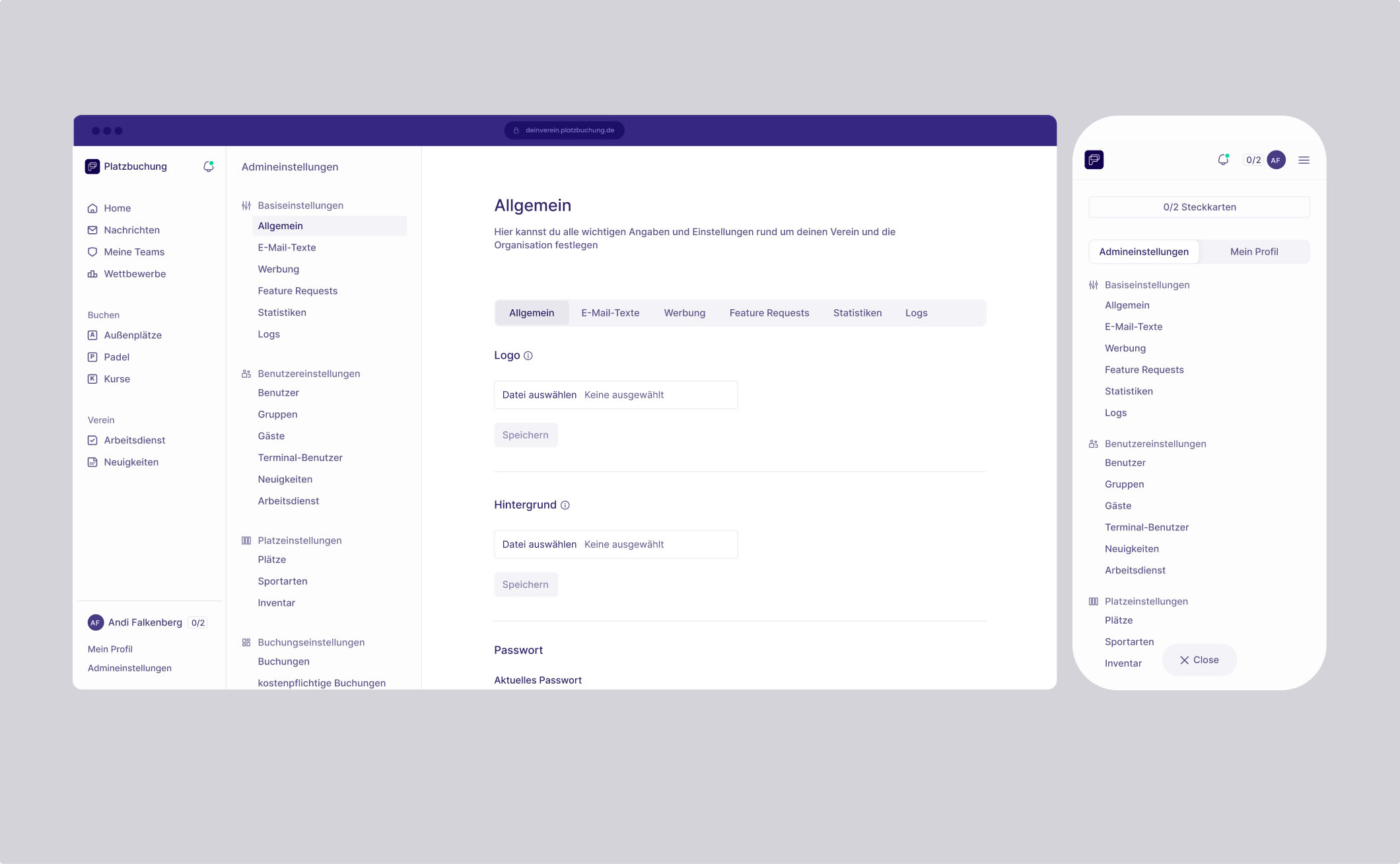
Key areas such as the dashboard, navigation sidebar, and settings were originally implemented from a technical perspective rather than a user-centered design approach. As a result, information hierarchy was unclear, accessibility was inconsistent, and important actions required unnecessary navigation.
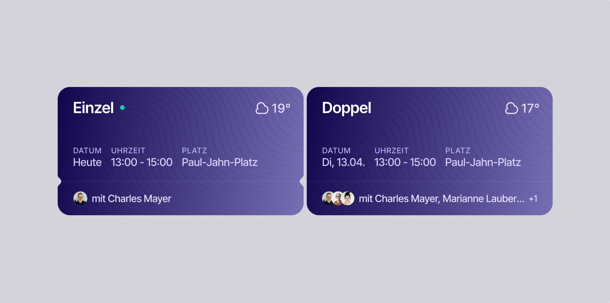
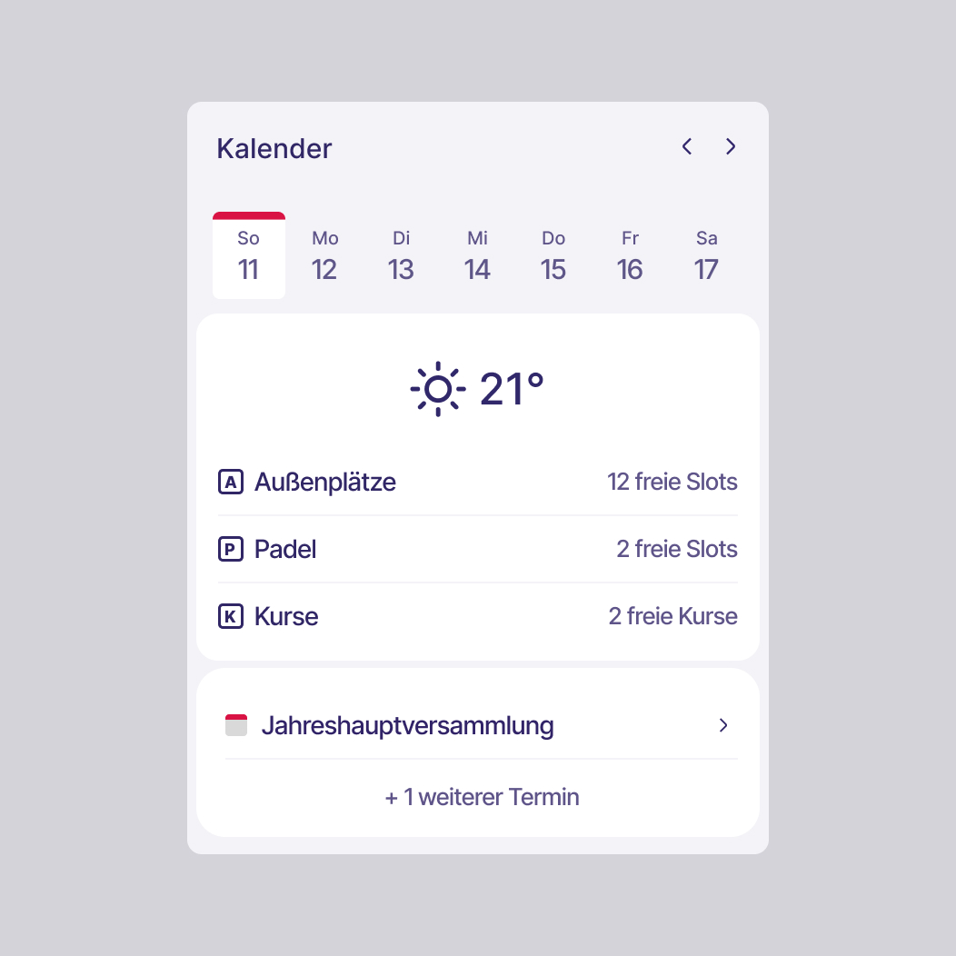
Members had limited visibility into their upcoming matches, court availability, and club activities. Relevant information was scattered across multiple sections, making it difficult to quickly understand what was happening in the club or what actions were required.
Solution:
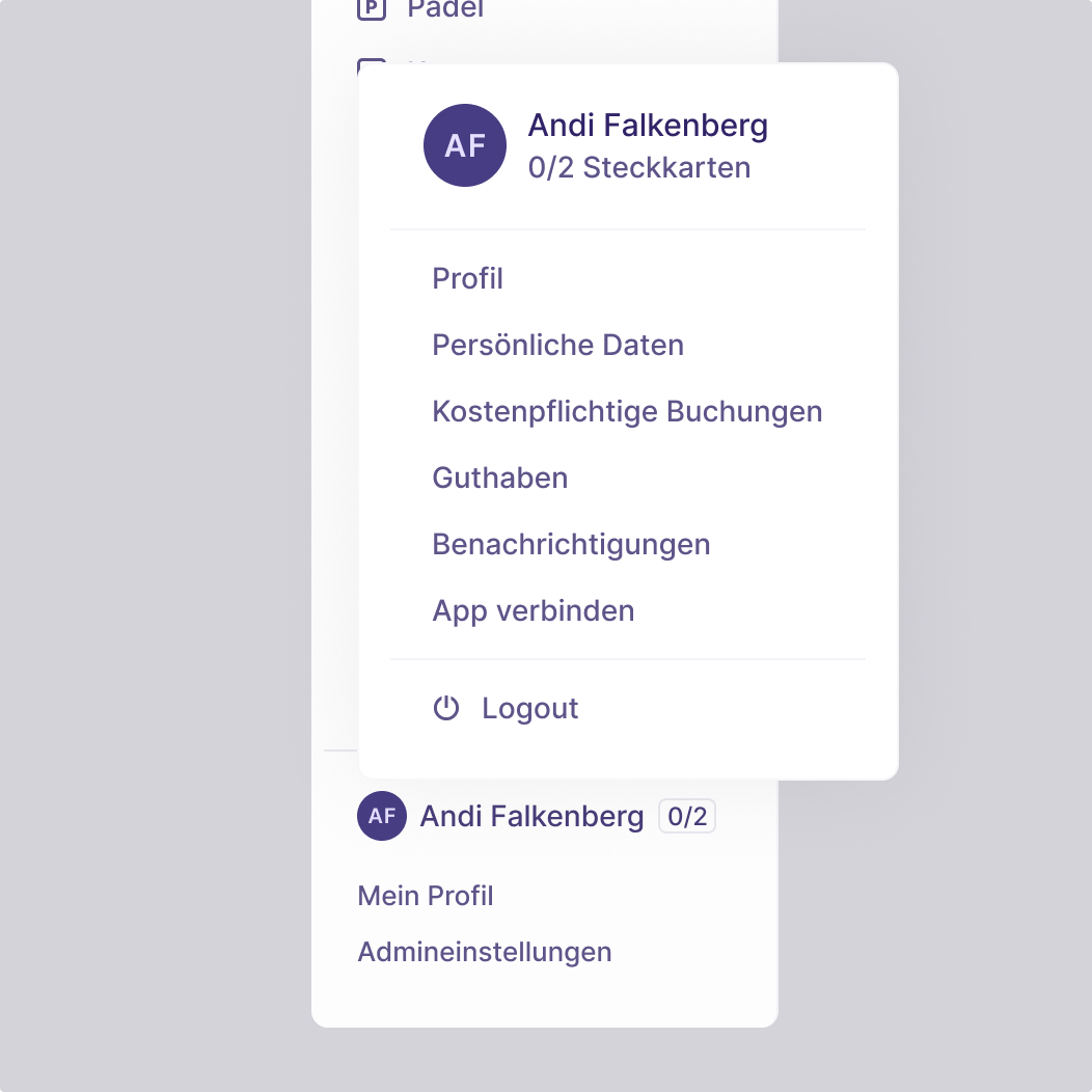
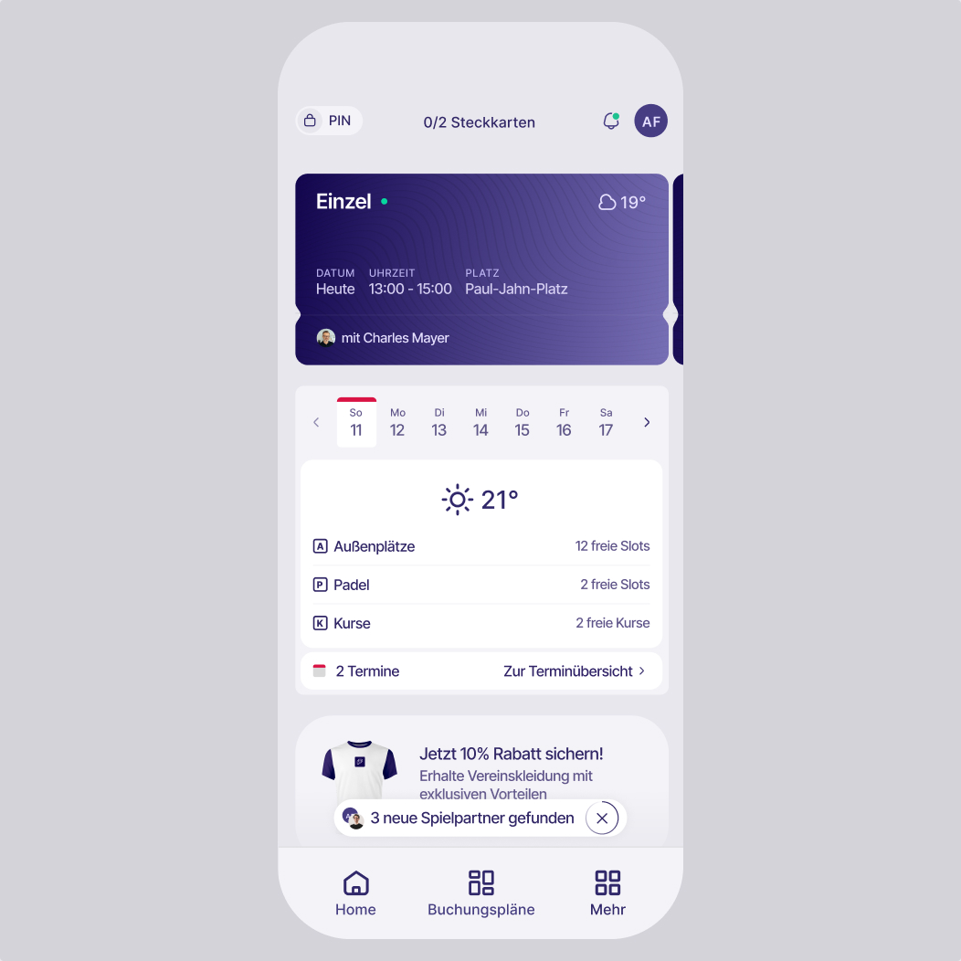
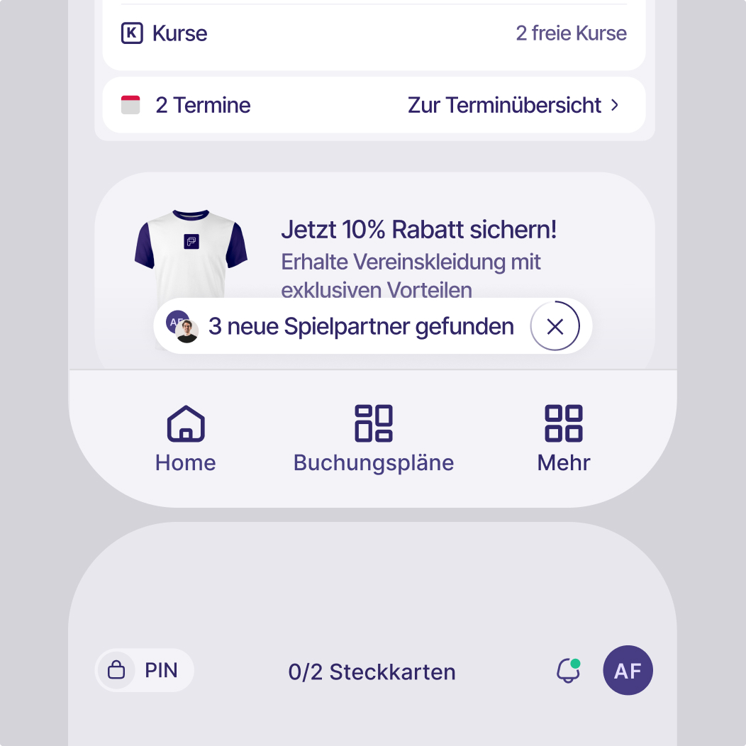
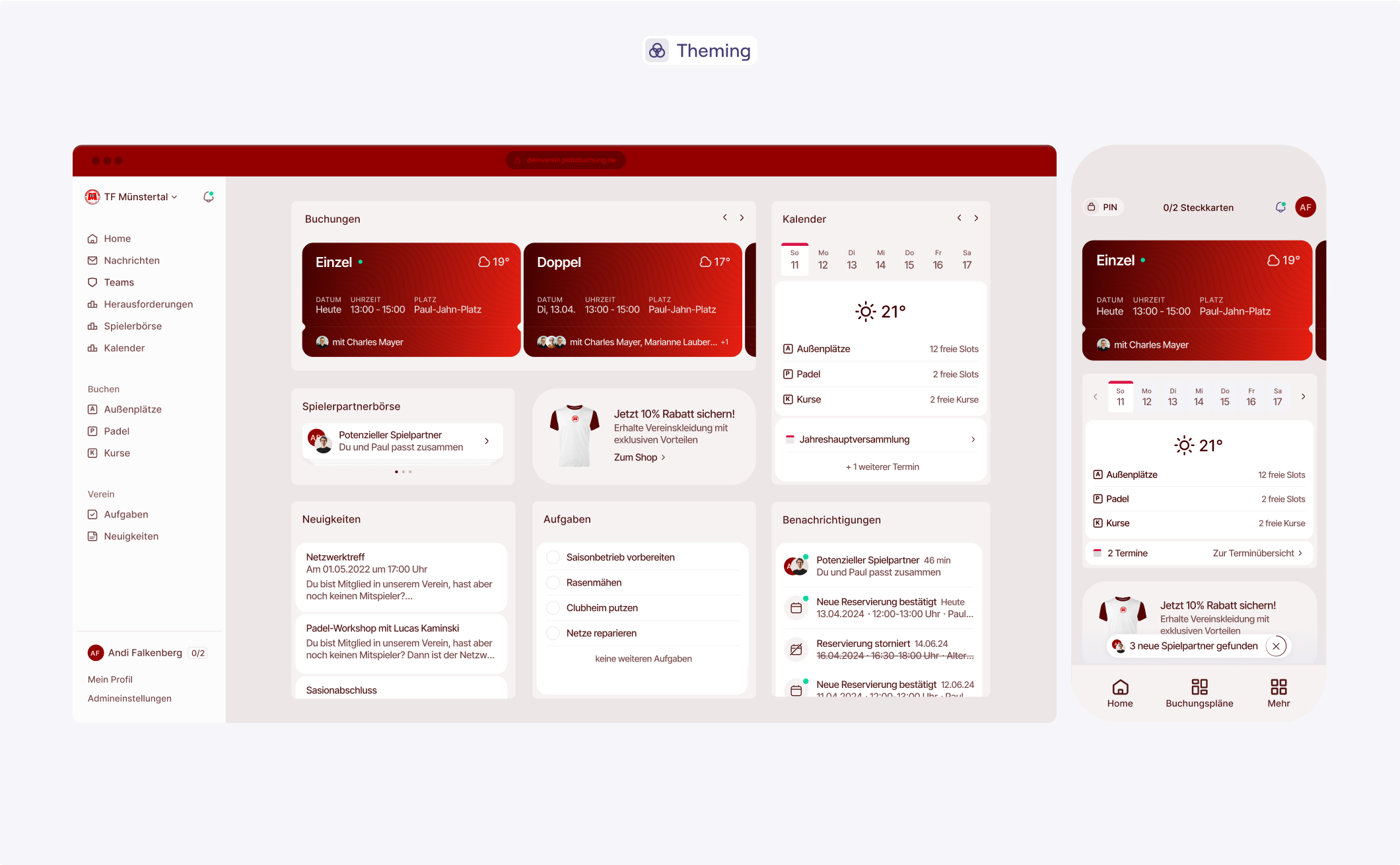
The dashboard and navigation system were redesigned across desktop and mobile to create a clearer and more structured member experience.
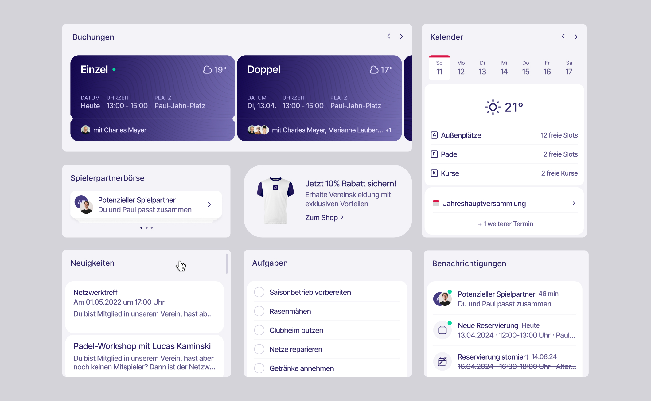
Modular information cards surface the most relevant information at a glance, including upcoming matches, court availability, club tasks, and member events. The sidebar was reorganized to improve navigation and make key areas such as bookings, calendar, and settings easier to access.
Overall, the layout prioritizes clarity, accessibility, and quick decision-making. Members can immediately see their next activities, explore available courts, and stay informed about club news and events.
Introduced Design System
and Theming
Context:
The platform needed to support multiple tennis clubs, each with its own identity and brand colors. At the same time, the interface had to remain consistent, accessible, and efficient to maintain as the product evolved.
Without a structured design system, visual decisions were scattered across the interface, making updates slower and increasing the risk of inconsistencies. In addition, the platform required a flexible way to adapt the interface to individual clubs while still guaranteeing accessibility and visual coherence.
This created the need for a scalable design foundation that would enable faster development, consistent UI patterns, and automated theming based on club identities.
Solution:
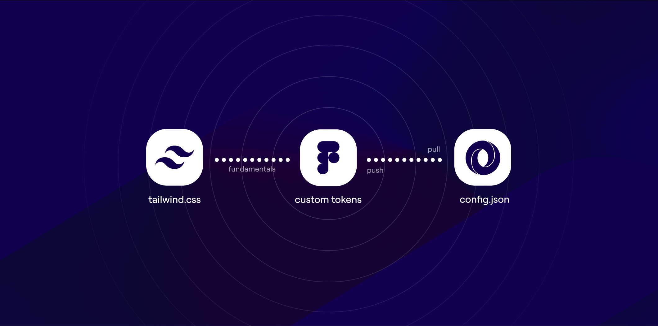
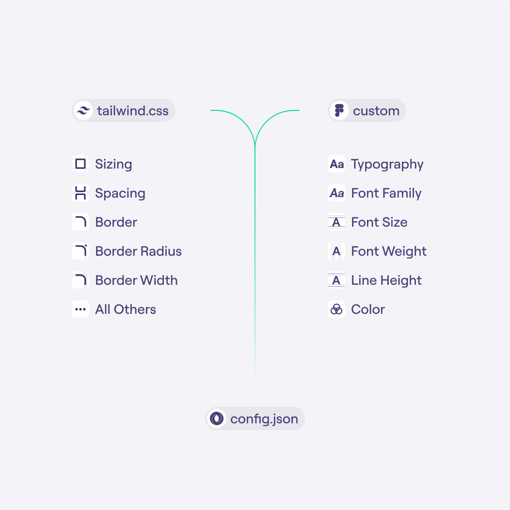
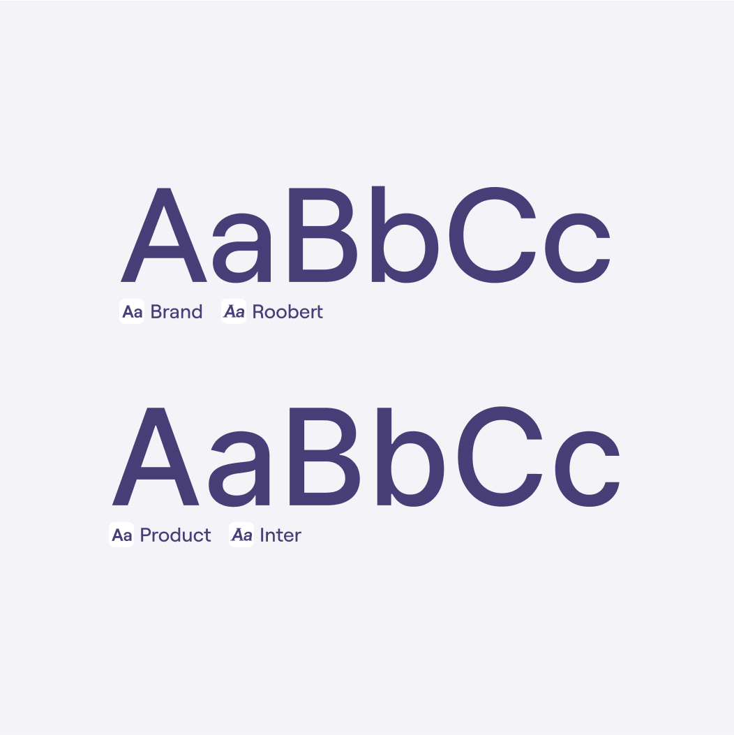
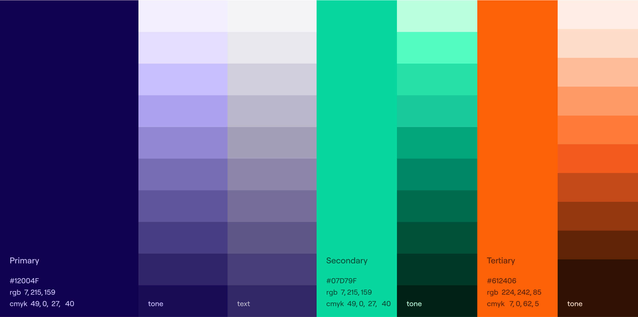
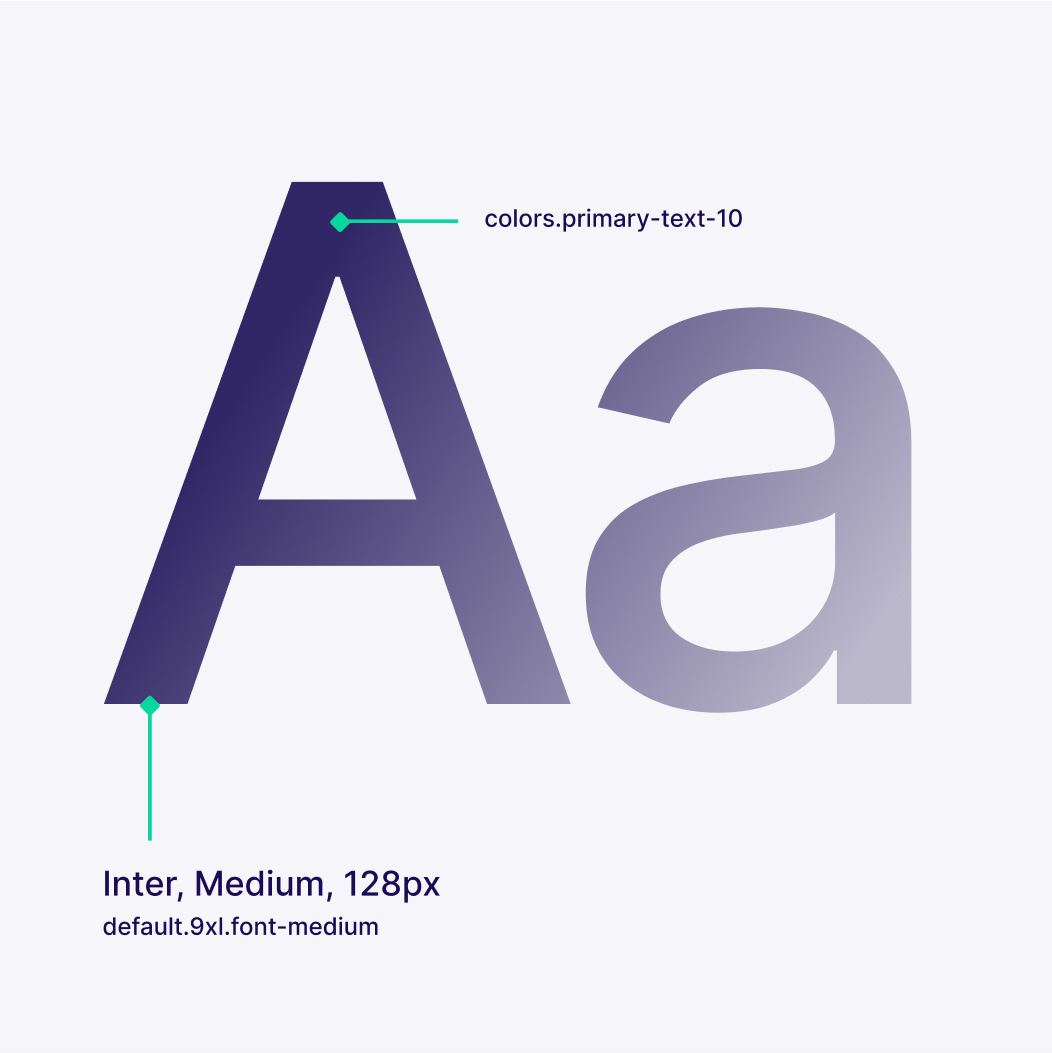
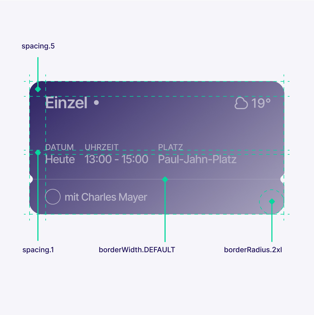
A token-based design system was introduced, built on top of Tailwind and extended with custom typography and color tokens. These tokens act as the foundation for the platform’s visual language and allow styles to be centrally defined and consistently applied across the interface.
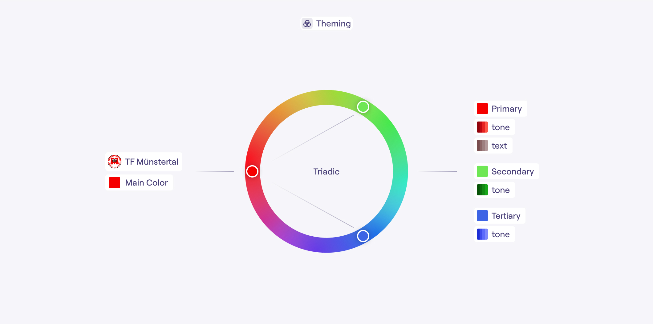
To support flexible theming, the system integrates Google’s HCT color model and a structured set of color tones. This makes it possible to generate accessible color palettes automatically while maintaining sufficient contrast in accordance with WCAG 2.1.
The theming mechanism allows club administrators to define a single primary club color within the platform. Based on this input, the system generates a complete and accessible interface theme that reflects the club’s identity while preserving usability and accessibility standards.
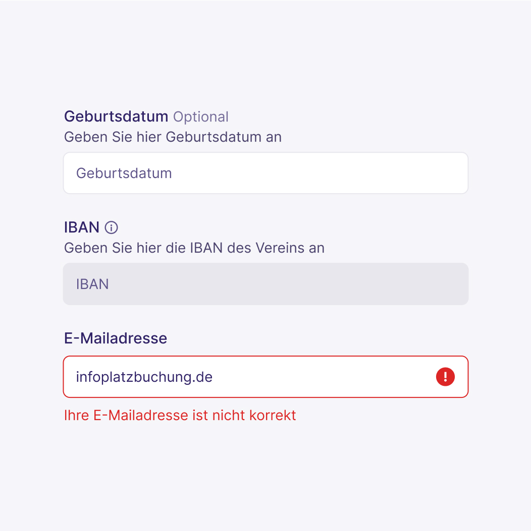
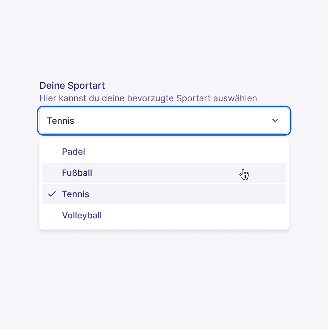
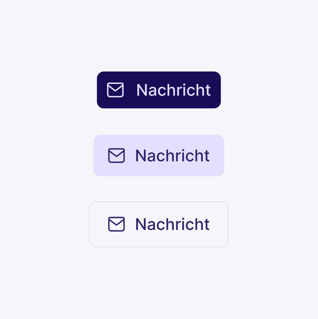
Alongside the token structure, the core components of the design system were also developed to ensure consistent layouts, interactions, and UI patterns throughout the product.
Product
Landing Page
Context:
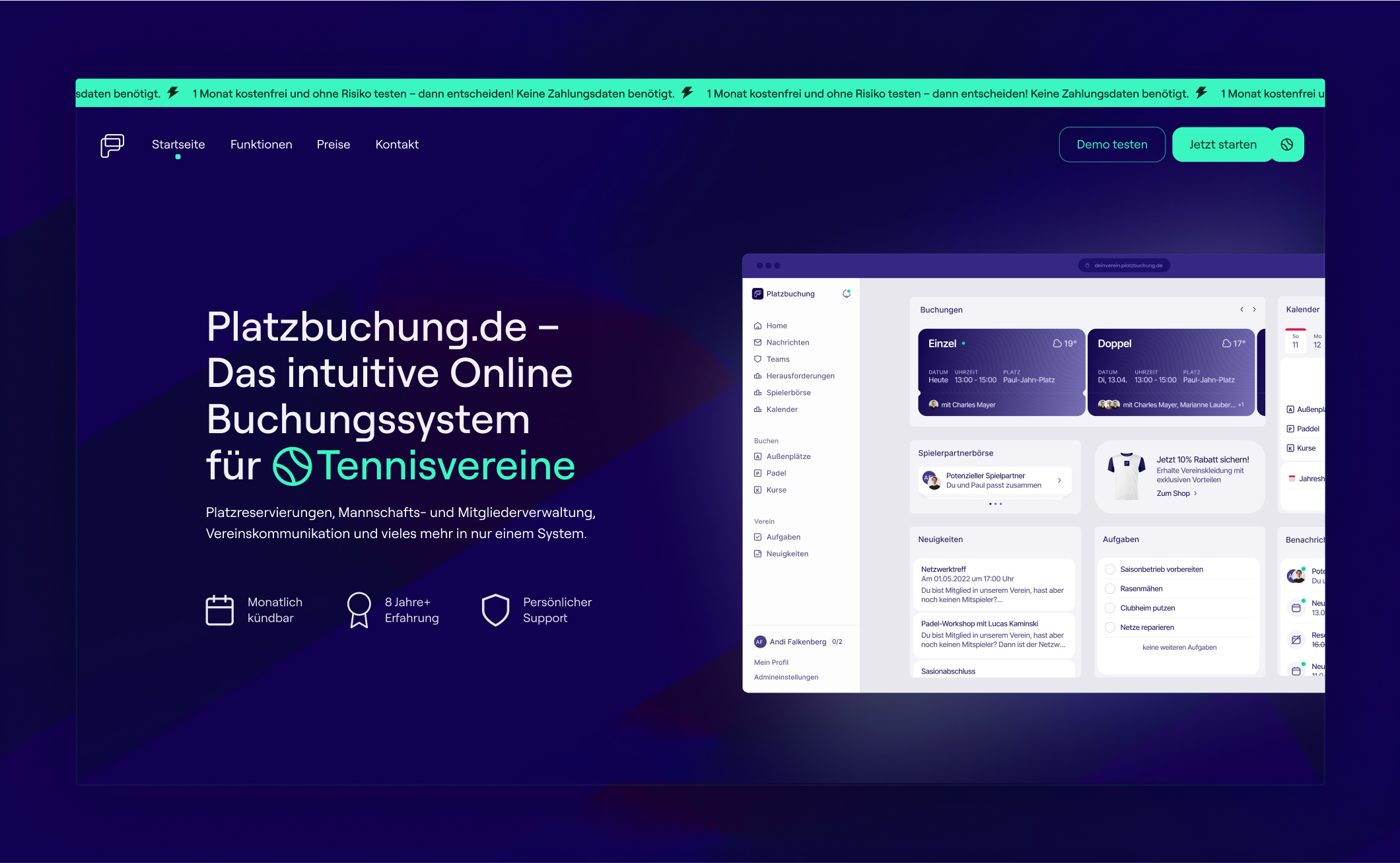
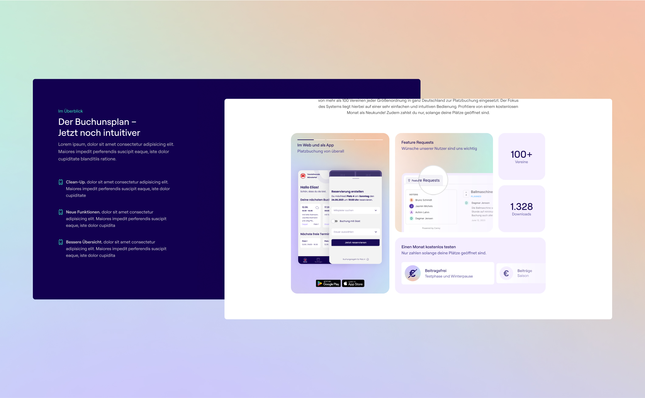
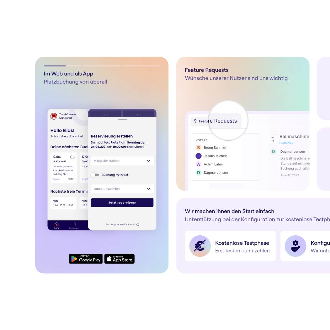
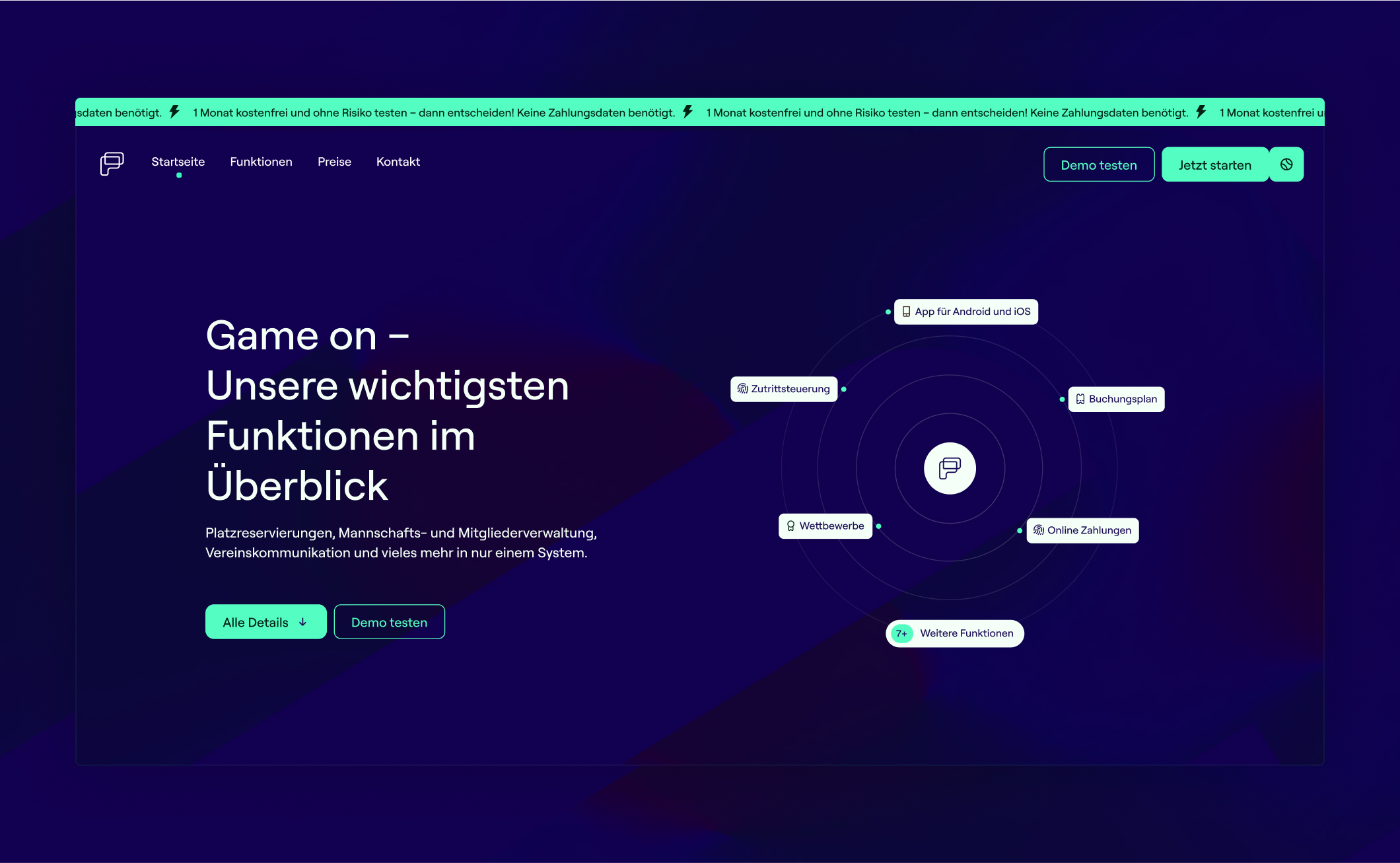
After establishing the core interface and the token-based design system, the next step was to extend the visual language beyond the product itself. The marketing landing page became an opportunity to apply the same design principles and components in a different environment.
Solution:
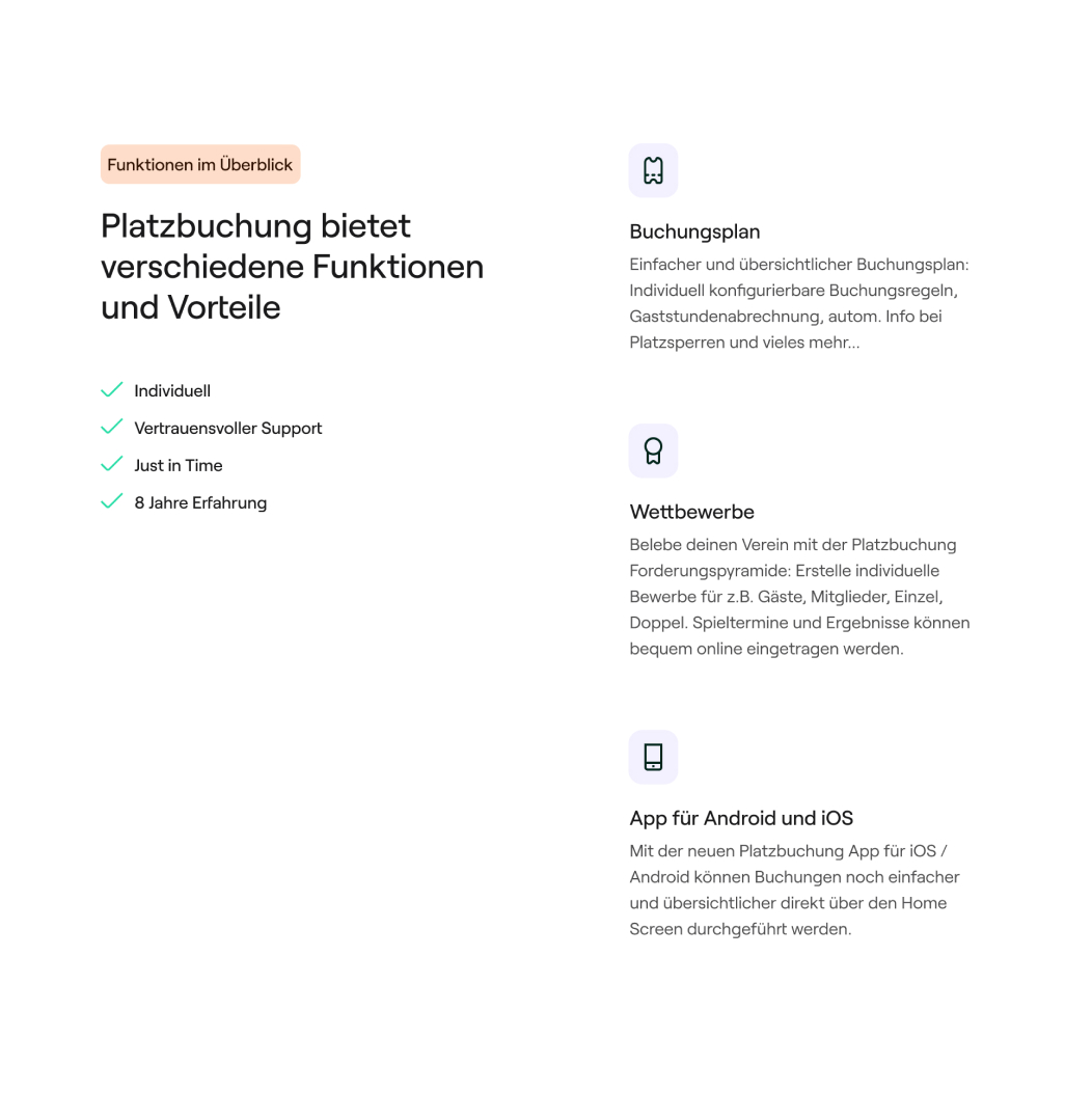
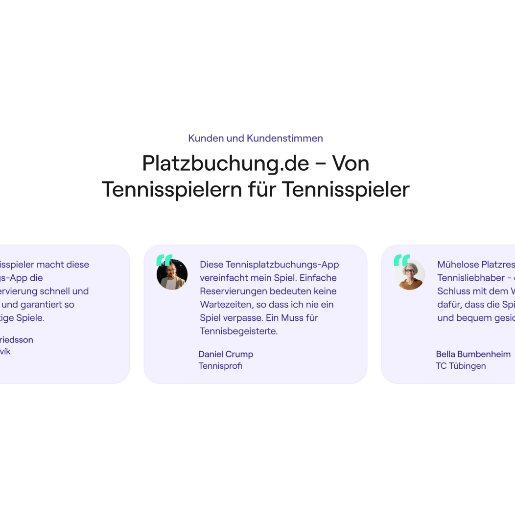
The landing page was built using the same design foundations defined for the product interface. Components, typography, spacing, and color tokens were reused and adapted for the web context.
In addition to presenting the product, the page served as a practical environment for validating design system elements in real layouts. This helped refine components and patterns while ensuring that the visual language remained consistent across both the platform and its public presence.